
It is time to get funky!

So far this series has covered a few simple usage tips, Now I will join a few bits together and mix in some cool tips.
I will be creating a post build guided user setup framework.
I recently had to do this for a client and only had DEPNotify to use. This was usable but somewhat limited as you can’t change the display position or shape, so a rectangle on the screen (even when dragged to the side) that gets covered up by the setup screens isn’t the best experience, as shown here:

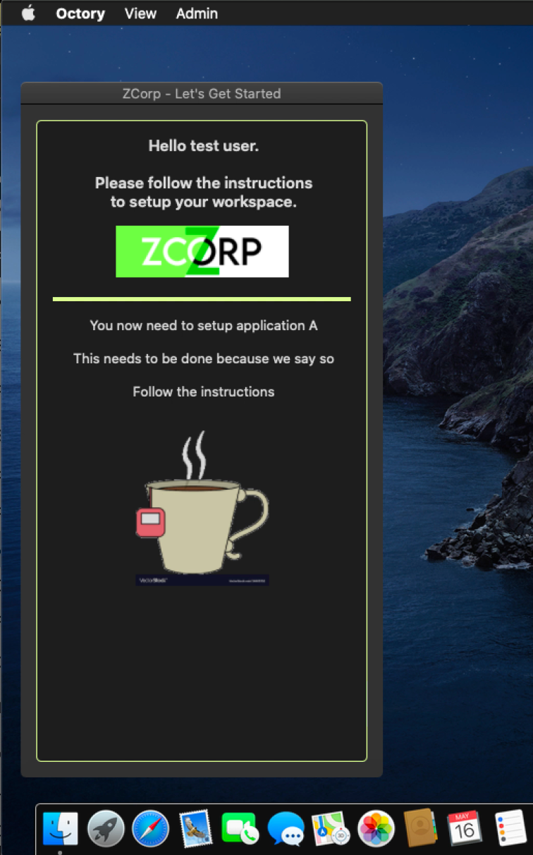
Back when Octory was Ceremony (all of 2019!) I suggested that a good feature would be the ability to open pinned to a side. This was implemented and gives a nicer way to achieve the user guide screens like this:

The dev team are always up for good FR’s, just ask them on the Octory slack channel. I’ve had a few suggestions taken on board and added to the product.
So this article will be about how to display a dynamically changing user process flow screen, and some nice visual customisation tricks.
Note: You need a Pro license for all of this to work as this allows the dynamic parts to work, though most of the other tips work on the free version.
Positioning the window.
The window can be positioned in both vertical and horizontal axis using the Position keys explained here.
Position is an optional key in the Window dictionary, and is itself a dictionary with two required settings: Horizontal and Vertical to define its position.
In my example it is set to Vertical = Center and Horizontal = Left.
<key>Position</key>
		<dict>
			<key>Vertical</key>
			<string>Center</string>
			<key>Horizontal</key>
			<string>Left</string>
		</dict>
The Maximum and Minimum window sizes are also set to control the shape and size of the box.
<key>MinimumSize</key>
		<dict>
			<key>Width</key>
			<integer>350</integer>
			<key>Height</key>
			<integer>650</integer>
		</dict>
		<key>MaximumSize</key>
		<dict>
			<key>Height</key>
			<integer>750</integer>
			<key>Width</key>
			<integer>350</integer>
		</dict>
Tip: to make a fixed size box set max and min size to be the same!
Bringing in some branding.
So you have a corporate branding scheme, let’s bring a bit of that into the Octory windows.
Note the preferences use the US spelling of Color however I use the Uk spelling of Colour, except when showing the actual preference setting
Text can be coloured but personally I found it better to leave most of the text as default then maybe colour titles, the window border and dividers.
To do this first define the colours you want to use in the ColourStyles dictionary, Octory is already built to cope with both dark and light mode of the mac so setting up different schemes is a breeze.
	<key>ColorStyles</key>
	<dict>
		<key>Corp</key>
		<dict>
			<key>LightMode</key>
			<string>#964BB3</string>
			<key>DarkMode</key>
			<string>#E2FF9F</string>
		</dict>
This colour style, (Corp), can now be used to colour other elements using the Color key as I’ll show later. The colour strings are HEX codes.
A Bit Edgy.
If you look at these images there is a border round the window, this border is a different colour for Dark and Light mode as specified in the ColorStyle above.

This is done by setting the ContainersBorderColor key as shown:
<key>Slides</key>
	<array>
		<dict>
			<key>ContainersBorderColor</key>
			<string>Corp</string>
This goes between the Slides array and the Containers array
Component Borders
All display components can have a border which takes the form of a horizontal line taking 90%, by default, of the available width. This can also take the colour style and the height can be adjusted.
In my example I added the Border to the Image component that displays the logo.
As can be seen the Height, Color and position are configured
<key>Border</key>
		<dict>
		<key>Height</key>
		<integer>4</integer>
		<key>Corp</key>
		<string>Lines</string>
		<key>Edge</key>
		<string>Bottom</string>
The important thing to remember is that because the ColorStyle defined both Light and Dark modes the colours automatically change.
Let’s Get Dynamic.
So far so good? It’s been about a bit of colouring in, all of which can be done in the free version. Let’s get cracking with the fun, and not free, bit.
Display components can be conditional, that is only displayed when a condition is met. So in this example the idea is the user gets presented with a set of information to complete a task, let’s say sign in to InTune.
So we want the text and any images to help them displayed until that is completed and then move on to the next stage, say sign in to Outlook, for which different words and images would be needed.
Conditions
For Conditions we need variables. Setting these will be covered later but first let’s talk about setting a conditions array up so they can be used easily rather than entering the whole condition every time.
<key>Conditions</key>
	<dict>
		<key>Display_setup1</key>
		<string>SETUP1_INSTALLATION_STATE != Installed</string>
		<key>Display_setup2</key>
		<string>SETUP1_INSTALLATION_STATE == Installed && SETUP2_INSTALLATION_STATE != Installed</string>
		<key>Display_setup3</key>
		<string>SETUP1_INSTALLATION_STATE == Installed && SETUP2_INSTALLATION_STATE == Installed</string>
	</dict>
In this conditions array we are setting up three stages of display. For simplicity the variables, defined later, have been named SETUP1_INSTALLATION_STATE and SETUP2_INSTALLATION_STATE.
The actual conditions are named Display_setup1 etc to match the screen components to be displayed.
This means we can set the individual components, whatever they may be to display or hide dependant upon the conditions defined in the array above.
So how do we do that?
On the display component we need to display we use the Condition key like so;
<code><dict>
	<key>Height</key>
	<integer>150</integer>
	<key>Condition</key>
	<string>Display_setup2</string>
	<key>Type</key>
	<string>Image</string>
	<key>URL</key>
	<string>${AppIcons}/office.png</string>
	<key>ShouldFillSpace</key>
	<false/>
</dict>
This section will show an Image only when the condition Display_setup2 is valid. This means the previous blocks set to display when Display_setup1 will also disappear. This gives us the dynamic display because a set of components are built up to display and a set of conditions to display/hide them.
Setting the variables
The variables used will be set in a Monitor. In previous posts I talked about using monitors with custom log entries. This technique is how this tool will be managed.
Note: Monitors do not have to be displayed! They can be used simply as a monitor to set variables.
Let’s look at a monitor.This is the Monitor that will generate variable SETUP2_INSTALLATION_STATE
<dict>
	<key>GenerateVariable</key>
	<true/>
	<key>Type</key>
	<string>Application</string>
	<key>Name</key>
	<string>SETUP2</string>
	<key>Installer</key>
	<string>Jamf</string>
</dict>
The variable will generate four possible states as shown in the documentation;

Note:I found that it was required to set the initial value of the Variables as there is a bug that doesn’t set them initially, this should be fixed in a later version.
<dict>
	<key>Variables</key>
	<dict>
		<key>SETUP1_INSTALLATION_STATE</key>
		<string>Not installed</string>
		<key>SETUP2_INSTALLATION_STATE</key>
		<string>Not installed</string>
		<key>SETUP3_INSTALLATION_STATE</key>
		<string>Not installed</string>
	</dict>
Putting it all together
So lets put this all together: Using the Monitor in the way I spoke about in this and creating a script to monitor the setting required and writing log entries to match the Monitors, which change the variables, and these change the displayed components you can build a dynamically changing guided user setup process that responds to the progress made.

And here is the demo in Dark and Light mode:
 MontysMacMusings